The bottle of Coca-Cola, arguably the most iconic bottle ever designed, was created to help the brand face its numerous imitators. Today, more than 100 years later, the design looks more beautiful than ever.
Here’s its story.
By 1912, Coca-Cola had to face an increased competition within the US. Competitors, like Koka-Nola, Ma Coca-Co, Toka-Cola and Koke were not only copying the product, they were also copying or slightly modifying the spencerian script logo and the bottle. (the article continues after the ad)
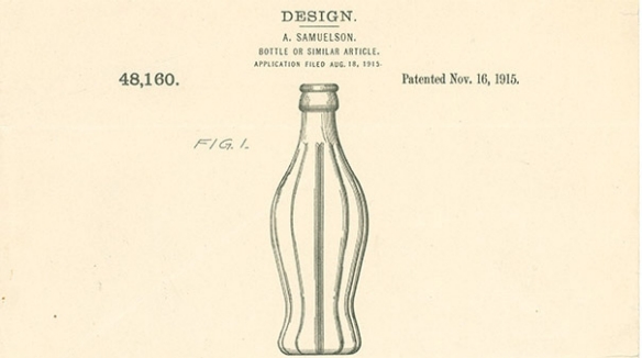
In 1915, wanting to protect the Coca-Cola brand, the management of the company decided to spent $500 so that a distinctive package is designed. The brief for the competition was simple: “we want a bottle so distinct that you would recognise it by feel in the dark or lying broken on the ground”.
Around 10 glass companies across the US entered the competition.
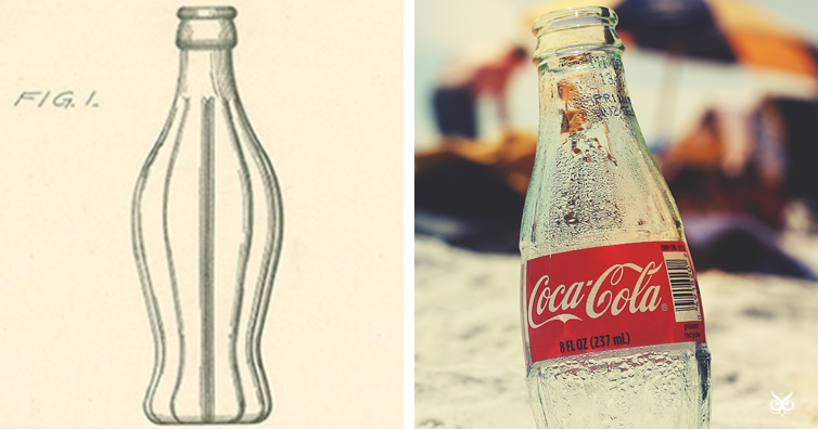
The winner was Root Glass Company, that designed the bottle based on the cocoa bean, with an elongated shape and distinct ribs:
It was decided that the bottle should be coloured “German Green” and the weight of the glass was to be no less than 14.5 ounces, which, when filled with the 6.5 ounces of Coca-Cola, made each bottle weigh more than a pound.
The design was of course patented with the patent expiring in 1951. But, even though the patent expired without a renewal option, the Patent Office recognised the Coca-Coca bottle as a trademark, something quite unusual for a commercial package.
A 1949 study showed that less than 1% of Americans could not identify the bottle of Coke by shape alone. Mission accomplished.
If you like what you read, then you will definitely love this one: Why Is Jack Daniel’s Sold In Square Bottles?
Photo: Records of the Patent and Trademark Office, National Archives, fancycrave1 / Pixabay

