
One of the most unique features of the iconic Heineken logo is its famous red star. This particular symbol though has proven to be quite controversial throughout the years. Here’s the story behind one of the most recognizable beer labels in the world.
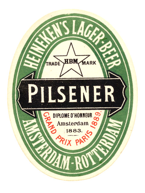
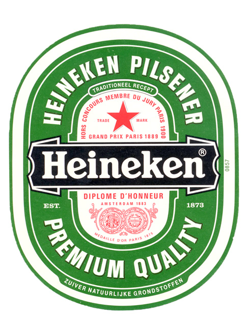
Heineken was established in Amsterdam in 1864 and the logo was created around 1883. It was an oval shaped label, painted in Heineken’s distinctive green with a black bar that read Pilsener and a black bordered star:

Why a star? Well, according to Heineken, five-point stars have been used by brewers since the Middle Ages and they symbolize beer’s ingredients: water, barley, hops, yeast, and a fifth element that comprises the “magic of brewing.” (the article continues after the ad)
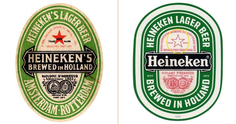
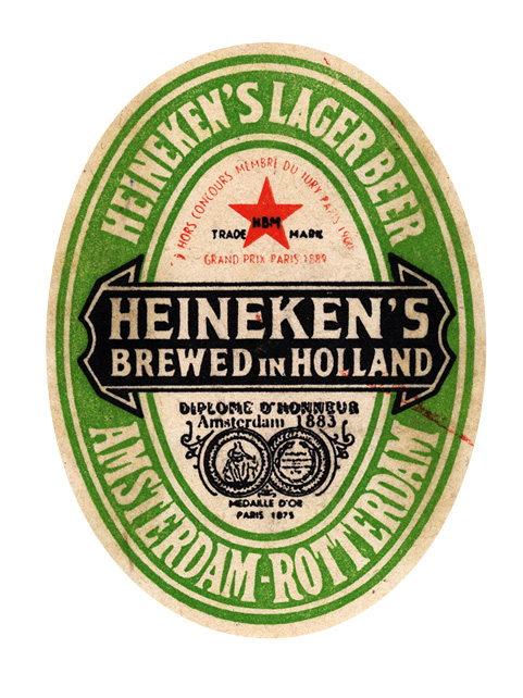
Over the years, the logo changed and the various international prizes won by the brewery were added to the design. In the 1930s, the label had its biggest change since Alfred Heineken decided that the black bar should read Heineken (instead of Pilsener) and, to emphasize on the star, the black border was replaced by a red star:
But then… World War II happen.
After the war ended in 1945, the United States as well as many European countries, despite being allies in WWII, they were now considering communist Russia as a threat. One of the most distinctive symbols of Soviet Russia was of course, the red star. Because of this similarity and in fear of being associated with communism, in 1951, Heineken dropped its red star and replaced it with a red bordered star:
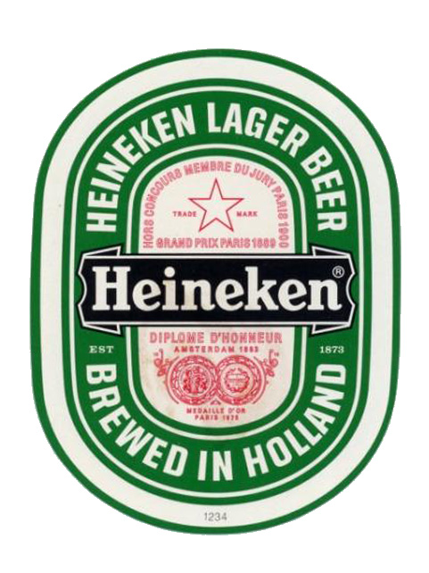
This logo remained in effect up until the end of the Soviet Union in 1991. As soon as the USSR disintegrated though, Heineken changed its label again to include their favorite red star: (the article continues after the ad)
Even so many years after the change, the red star is still causing problems to Amsterdam’s brewer. In 2017, the Hungarian parliament discussed a ban on Heineken because with the claim that the trademarked red star relates to the Nazi occupation and the 40 years communist rule. Heineken is of course defending itself but Hungarian officials seem to insist on the ban.
Will Heineken need to replace its red star again? Nobody knows but it’s quite interesting that just a simple branding feature is enough to cause such a controversy!
BONUS FACT: The “e”s on Heineken font are intentionally given a small backward slant in order to give the impression of a smiley face (they are called the “smiling E”).
If you like what you read, then you will definitely love this one: Apple Logo Designer Reveals Why The Logo Has A Bite
Main Article Photo: Heineken Collection Foundation
Photoshop: I’m A Useless Info Junkie
Sources: THE HEINEKEN LABEL | Hungary may ban Heineken’s red star symbol as it recalls Nazi occupation | RED SCARE