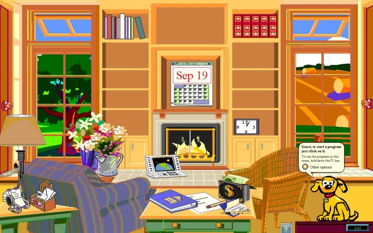
In 1995, Microsoft released Microsoft Bob, a version of Windows aiming in making computers more user-friendly than Windows 3.1 or the (soon to be released) Windows 95. To achieve that, they created an interface of the software that was based off of a house; with rooms, furniture, wall calendars and other every day items.
The idea was that users could more easily navigate themselves to the required software by clicking on familiar objects. For example, if you wanted to open Word, you would have to click on the paper and the pen located in the living’s room table or if you wanted to see the time, you would click on the wall clock!
The project was sooooo weird that lasted only a year; Microsoft killed it in early 1996.
If you like what you read, then you will definitely love this one: Microsoft Windows XP Wallpaper: The Story Behind The Most Viewed Photo Ever Taken


Photo: ClifNotes / FreewareWiki
Widget not in any sidebars

